We rebuilt the icon, header, and bio of our official X account, @metronome_fm, to match the current logo and the look of the app. We also added a link to the X account on the top page of the docs, which explain how to use the app.

The old icon and header still used the logo from before the app got its current look. The bio was also out of date and listed only two features: "track sets" and tempo ramps, which raise the tempo little by little. The new bio lists tempo ramps, custom beats, polyrhythms, AI BPM search, and the tuner and drone.
This post is mostly about what we thought about while making the header image (1500×500). At the end, it also touches briefly on the icon image.
Matching the look of the OG image
The image that appears when a page is shared on social media is called the OG image. We gave the header the same look as Metronome.fm's OG image: a black background, a headline in light IBM Plex, a ruler of tempo ticks, and the turquoise accent. The logo and headline sit on the top row, and the ruler on the bottom row. As in the OG image, the colors are taken directly from the app's dark theme.
The ruler's ticks also match the OG image and the tempo ruler on the app's screen. It spans 40 to 300 BPM in steps of 5, with longer ticks every 10 and numbers every 30. As in the OG image, the marker is at 120 BPM, in turquoise. Ticks left of the marker (slower tempos) are brighter, and the rest are darker.
// scripts/x-profile/render.mjs (excerpt)
for (let value = min; value <= max; value += 5) {
  const major = value % 30 === 0;
  const mid = value % 10 === 0;
  const length = major ? 44 : mid ? 28 : 16;
  // Ticks left of the marker (slower tempos) are brighter, the rest darker
  const color = value <= bpm ? COLORS.tickOn : COLORS.text3;
  // …
}Leaving only the bottom left empty for the icon
On an X profile, the round profile icon overlaps the bottom left of the header. In 1500×500 coordinates, it covers roughly 400px from the left and 170px from the bottom.
In the first version, we pushed everything past that area, to the right of x=470, so that no text or ruler would be hidden. But the icon only covers the bottom left. Because the top left was left empty too, the header had a large blank rectangle.
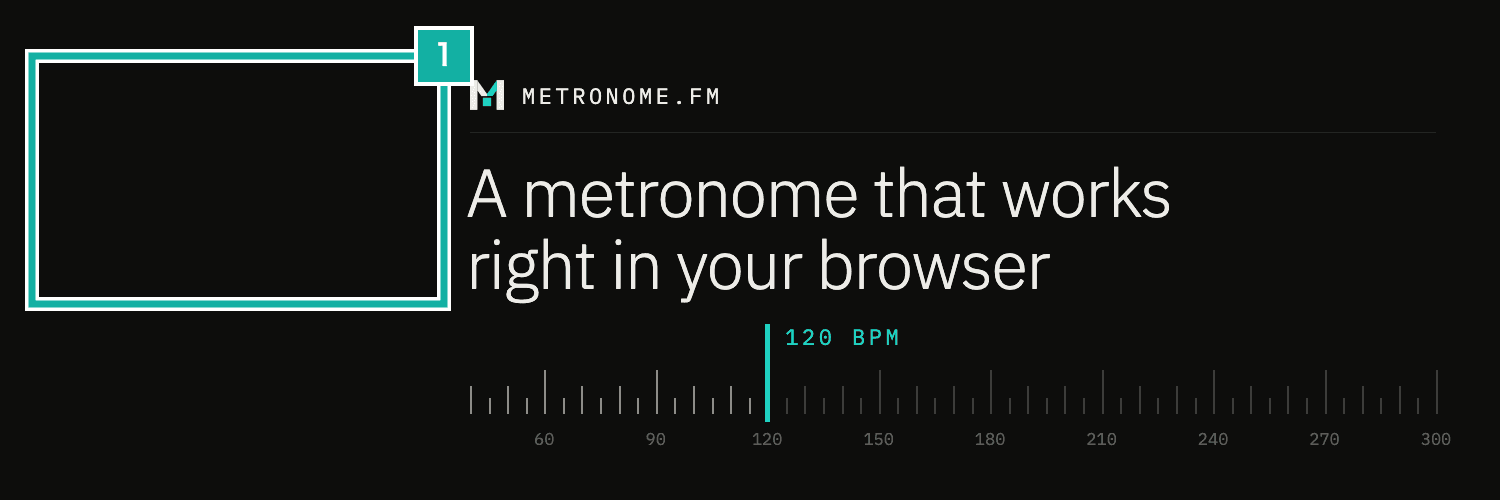
- Space left empty even though the icon never covers it
In the revised version, the top row (the logo with the METRONOME.FM text, or wordmark, and the headline) starts from the left edge, as in the OG image, and only the ruler on the bottom row sits to the right. The second line of the headline (A metronome that works right in your browser) ends above the top of the round icon. The icon overlaps the space left of the ruler.
An X header might get cropped at the top and bottom depending on the screen. So we also kept text away from the top and bottom edges and grouped the content in the middle.
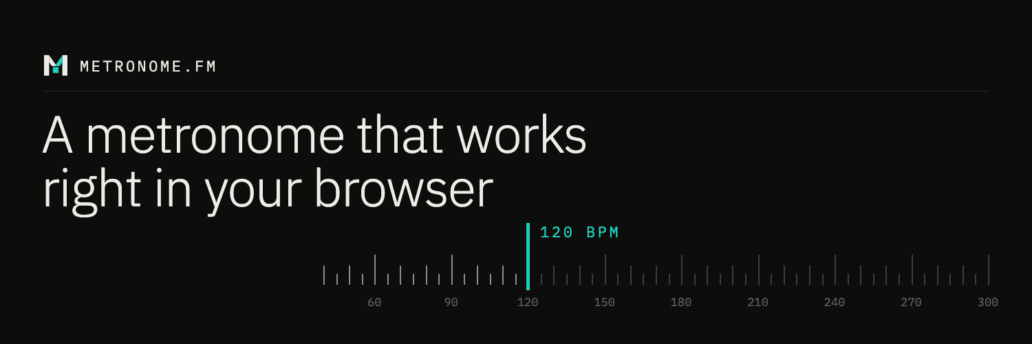
Set on X, it fits like this.
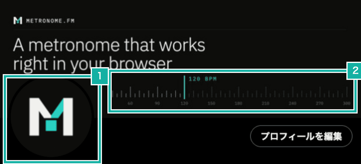
- The area the round icon covers. Nothing is placed here
- The ruler starts to the right of the icon
Exporting the header and icon from HTML to PNG
The header and icon are written as HTML, opened in Playwright, and saved as PNG screenshots. Fonts load from Google Fonts, and the positions of the text and ticks are set as CSS coordinates. To change something, we edit the numbers in the script and run it again.
node scripts/x-profile/render.mjsThe icon (400×400) uses the same logo shapes as the site's favicon. X crops the icon into a circle, though, so at the favicon's size the corners of the logo come close to the edge of the circle. So we scaled the logo to 0.8 to leave room inside the circle.
// scripts/x-profile/render.mjs (excerpt). In 48×48 coordinates, scale around the logo's center
<g transform="translate(24 24) scale(0.8) translate(-24 -24)">${LOGO_PATHS}</g>We will also post Metronome.fm updates on X.