Each time Metronome.fm gained a new feature, a switch for how that feature looks went into the menu. Recording brought "Show record button", and showing the beat with a pendulum instead of the beat meter brought "Switch to Pendulum". When you could pick an accent color, color swatches went next to the language and theme settings at the very bottom of the menu.
One at a time, this was fine. But at some point the display settings had ended up in three different places in the menu.
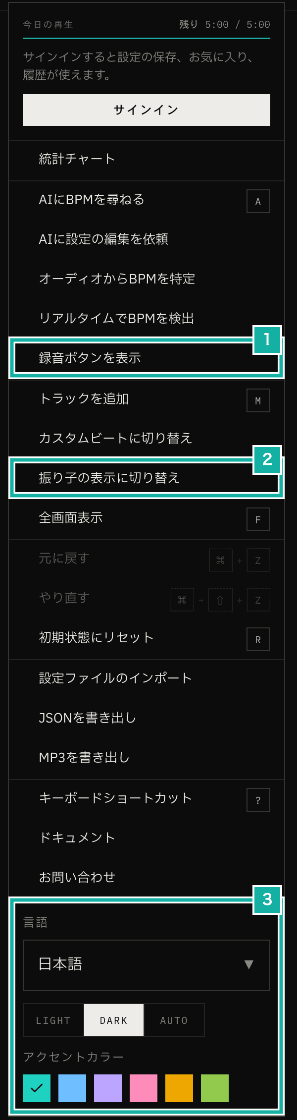
- Switch to show the record button
- Switch for the beat display
- Language, theme and accent color
Switches for how things look were mixed in with actions such as asking AI for a BPM or adding a track, and the menu had grown long. So I gathered everything about the display into one place, Display Settings. This post covers what moved into Display Settings, what stayed in the menu, and how the Display Settings screen is laid out.
One "Display Settings" item in the menu
I removed the two items "Show record button" and "Switch to Pendulum", along with the language, theme and accent color settings at the very bottom, and put a single "Display Settings" item in the menu instead. It opens the Display Settings dialog.
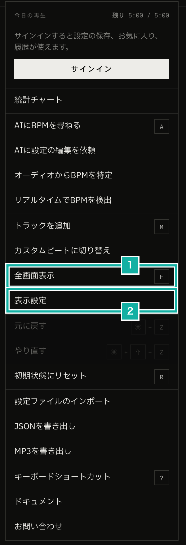
- Full Screen stays in the menu
- Opens Display Settings
Of the display-related items, only Full Screen (a mode that shows the beat display large in the middle of the screen) stayed in the menu instead of moving into Display Settings. I explain why later in this post.
The Display Settings dialog
Display Settings lets you change the language, theme, accent color, beat display (beat meter or pendulum) and footer buttons. Every choice shows up on the screen right away, so there is no save button.
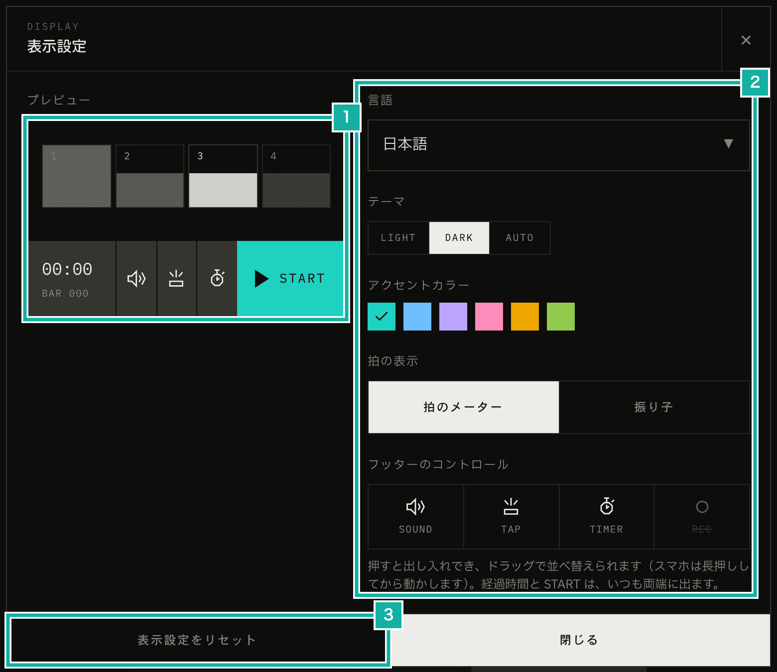
- Preview
- Settings
- Resets everything except the language to the defaults
With the settings in one place, there was also room for a reset button. Pressing RESET DISPLAY puts the theme, accent color, beat display and footer buttons back to their defaults, as if you had never changed them. You do not need to remember what you changed. The language is not reset, because it may have been chosen from your browser's settings.
Display Settings can also be opened from the menu on docs and blog pages. When opened there, it hides the settings for the metronome screen (beat display and footer buttons) and shows only the language, theme and accent color.
A preview on the left on wide screens
On screens at least 768px wide, Display Settings shows a preview on the left (narrower screens don't show it). For the beat display and the accent color, I wanted you to see how they actually look rather than choose them from a label.
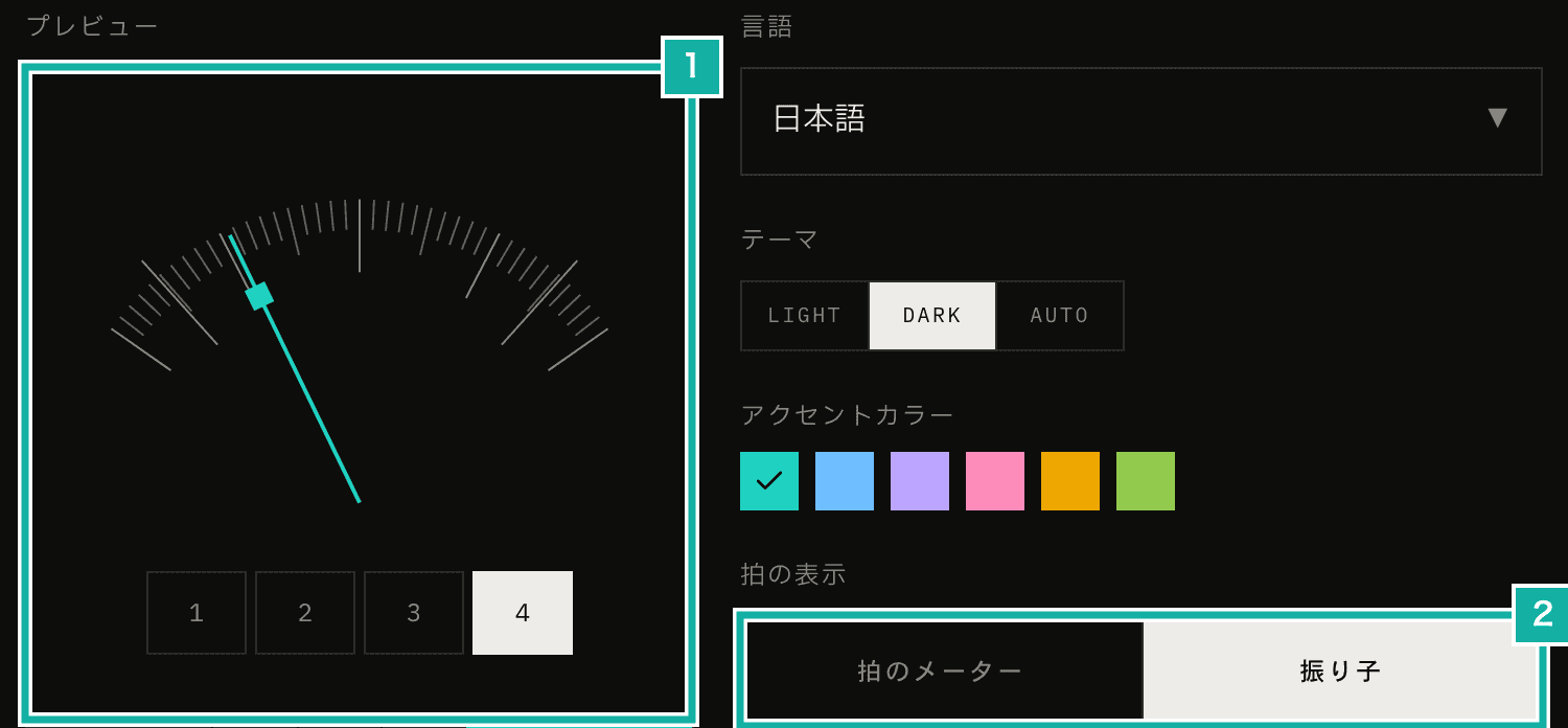
- The pendulum in the preview
- The beat display you chose
Like the demos in the manual, the beats in the preview run separately from the app's metronome playback, and only while Display Settings is open, at 96 BPM and without sound. The accent color and theme change the colors of the whole page, so the preview shows the same colors.
Choosing and reordering the footer buttons
The bar at the bottom of the screen (the footer) shows the elapsed time, SOUND, TAP, TIMER and START, plus REC if you turn on the record button. Of these, you can now choose whether to show SOUND, TAP, TIMER and REC, and change their order.
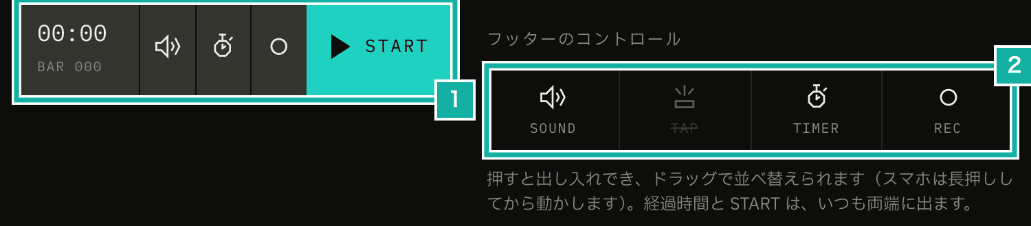
- The footer shown in the preview
- Tap to show or hide, drag to reorder
The settings on the right show these four buttons as small square tiles. Tapping a tile shows or hides that button, and hidden buttons are faded with a line through the name. You can drag tiles to reorder them; on a phone, press and hold first. Reordering is built with a library called dnd-kit, the same as in the multi-track screen.
The elapsed time and START have fixed positions and can't be moved, so they are not tiles. You can check how the finished footer looks in the preview on the left. While I was building it, I had samples of the elapsed time and START at both ends of the row of tiles. But I plan to let you choose more buttons later, such as statistics and BPM detection. With more buttons in mind, I dropped the samples, and the tiles are just the buttons, wrapping every four.
Keeping buttons from overlapping as you add more
Each button in the footer sits in its own slot (a cell), and the more buttons you show, the narrower each cell gets. The cells had a minimum width, so on narrow screens they overlapped the next cell and the labels got cut off. Now each cell uses CSS container queries, which change the look based on the cell's own width: the icon shrinks with the cell, and the label under the icon is hidden when the cell is narrower than 44px.
@utility mfm-transport-cell {
  container: mfm-transport-cell / inline-size;
  min-width: 0;
  overflow: hidden;

  & [data-transport-icon] svg {
    width: clamp(1rem, 55cqi, 1.375rem);
    height: clamp(1rem, 55cqi, 1.375rem);
  }

  @container mfm-transport-cell (width < 2.75rem) {
    & [data-transport-caption] {
      display: none;
    }
  }
}The icon is sized at 55% of the cell width, but never smaller than 16px or larger than 22px. With four buttons on a phone, the labels are hidden and only the icons show.
Full Screen stays in the menu
Full Screen shows the beat display large in the middle of the screen. It is about the display, so at first I thought about putting it in Display Settings too.
Unlike the other settings, though, Full Screen is not something you choose once and leave as is. You enter it right before you start playing with your device on a music stand, and leave when you are done. In Display Settings, it would take more steps: open the menu, open Display Settings, press Full Screen, close the dialog. It is something you want to switch quickly, so it stays as one item in the menu, and the F key on the keyboard still works too.
As a side note, when you enter the app's Full Screen, the app also calls the browser's own fullscreen (the Fullscreen API) within the handling of that same tap or key press. Browsers refuse fullscreen requests made outside the handling of a user action.
export const openFullscreen = () => {
  useFullscreenStore.setState({ isOpen: true });
  // Make the whole page (html) fullscreen
  document.documentElement.requestFullscreen().catch(() => {
    // If refused, keep going with the in-app switch only
  });
};Switching from the docs header
The header of the top page already had switches for the accent color, theme and language (JA / EN). The docs are pages for reading, and pressing a button in the header once is easier than opening the menu and finding Display Settings. So the docs header now has the same switches.

- Accent color, theme and language switches
The top page and the docs use the same components, so the switches look and work the same. Switching the language takes you to the same page in English (or Japanese). On phone-sized screens there is not enough room next to the logo and the menu, so the language switch is not shown in the header and you change the language from Display Settings in the menu.
With the switches in the header, Display Settings in the docs menu still works as before. In the app or in the docs, opening "Display Settings" in the menu lets you change how things look.