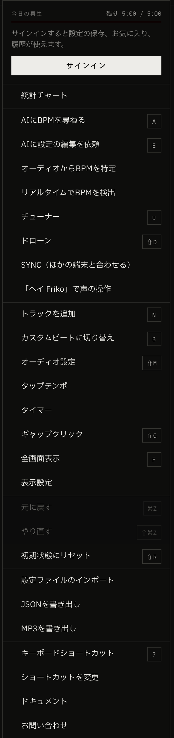
As the app gained features, its menu gained items, and it ended up with 28 rows. On a laptop screen the bottom was cut off, and you had to scroll to reach Contact Us.
So we grouped related items into smaller menus that open to the side when you press a row (submenus), bringing the menu down to 15 rows. This post covers how we grouped them, how much of the submenu behavior we could leave to React Aria Components' SubmenuTrigger, and what we still had to build ourselves, such as how submenus open on narrow screens.
From 28 rows to 15
We made six submenus:
- AI: Ask AI for BPM, Ask AI to Edit Settings
- Find BPM: from audio, live, tap tempo
- Practice Tools: tuner, drone, gap click, timer
- Edit: undo, redo, reset to initial state
- File: Import Settings File, Export as JSON, Export as MP3
- Help: Keyboard Shortcuts, Customize Shortcuts, Documentation, Contact Us
Items that are used often or make sense on their own, such as Statistical Charts, SYNC (match with other devices), Save Current Setting, Add Track, Audio settings and Display Settings, stay at the top level of the menu instead of going into a submenu. Undo and redo are mostly used from the keyboard (⌘Z and ⇧⌘Z on a Mac, Ctrl+Z and Ctrl+Shift+Z on Windows), so we decided they could sit one level deeper in the menu.
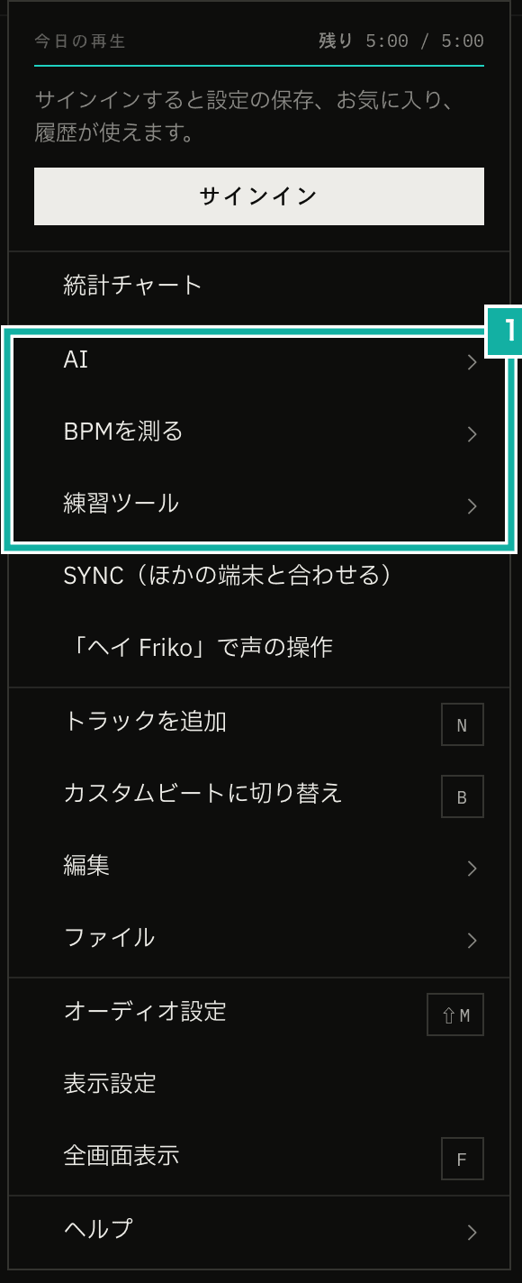
- Rows that open a submenu. The arrow on the right shows that pressing the row opens a menu to the side
Submenus are harder to get right in behavior than in looks
Drawing a row that opens a submenu and the submenu's box beside it is not hard. The work is in making it behave naturally with a mouse, a keyboard, touch and a screen reader.
For example, if the submenu opens the moment the pointer enters a row, it flickers as you just move the pointer up and down the menu. Once it is open, moving the pointer diagonally toward the submenu passes over other rows on the way, and the submenu would close. With a keyboard, you have to decide which key opens it, which key closes it, and where focus (the place keyboard input goes) returns after it closes.
The app menu was already built with React Aria Components' Menu, so we built the submenus with SubmenuTrigger from the same library. You wrap the row's MenuItem and the Popover that opens as the submenu in a SubmenuTrigger.
<SubmenuTrigger>
  <MenuItem id="submenu:practiceTools">Practice Tools</MenuItem>
  <Popover>
    <Menu onAction={onAction}>
      <MenuItem id="openTuner">Tuner</MenuItem>
      <MenuItem id="openDrone">Drone</MenuItem>
    </Menu>
  </Popover>
</SubmenuTrigger>What React Aria takes care of
Reading what is inside SubmenuTrigger (useSubmenuTrigger in @react-aria/menu), we found that it already handles all of the details above.
With a mouse, it waits a moment before opening and stays open on a diagonal move
When the pointer enters a row, the submenu opens 200 ms later (the default delay). Running the pointer up and down the rows does not open it.
Once it is open, the parent menu's rows stop reacting to the pointer while it moves toward the submenu (useSafelyMouseToSubmenu). Whether the pointer is heading there is decided by angle. From the previous pointer position, it takes the directions to the top and bottom edges of the submenu, widens each outward by 15°, and treats the movement as heading to the submenu if its direction falls between them. Passing over other rows on the way does not close the submenu. If the pointer does not move for one second, the rows react normally again.
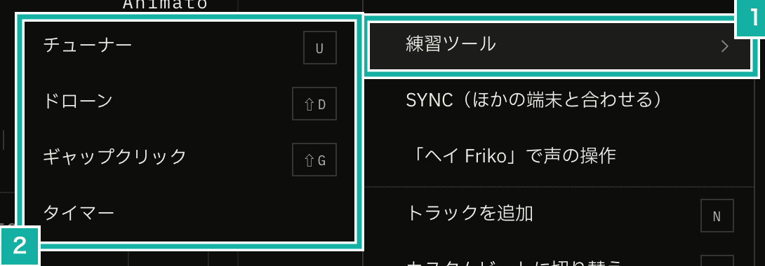
- The row that opened the submenu stays highlighted after the pointer leaves it
- There is no room on the right, so it opens to the left
This app's menu opens at the right edge of the screen, so there is no room for the submenu on the right. React Aria works out the position and opens it on the other side (left), and for rows near the bottom of the screen it shifts the submenu up to keep it on screen. The diagonal-move handling also works out the direction when the submenu opens to the left.
With a keyboard, → opens and ← goes back
When a row has focus, pressing → opens the submenu and moves focus to its first item. Inside the submenu, ← or Esc closes only the submenu and returns focus to the row that opened it. In right-to-left languages, → and ← are swapped.
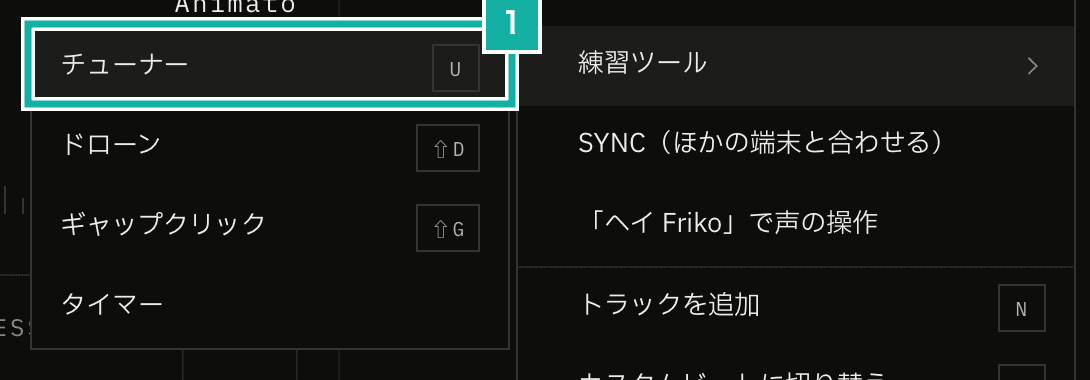
- Opening with → moves focus to the first item
When the submenu is opened with the mouse, focus stays where it is; only when it is opened with a keyboard or a screen reader does focus move to the first item. How it was opened is told apart by the pointerType of the press: keyboard for a keyboard and virtual for a screen reader.
Screen readers hear that the row opens a menu and whether it is open
The row gets aria-haspopup="menu" and aria-expanded, and while it is open, aria-controls points to the submenu. The submenu takes the row's name through aria-labelledby, so it is read out as the Practice Tools menu.
Our E2E tests (automated tests that drive the page in a browser) use these attributes too. They check that aria-expanded becomes true after pressing the row, and that the menu found by the row's text has all its items.
const row = page.getByTestId("app-menu-practiceTools-submenu");
await expect(row).toHaveAttribute("aria-expanded", "true");
const submenu = page.getByRole("menu", { name: await row.innerText() });With touch, it opens when the finger lifts
When you open a submenu by pressing the row, with a mouse click or a touch, it opens when the button or finger is released, not when the press starts. (With a mouse, resting the pointer on the row also opens it, as described above.) If it opened right away, the finger could lift over an item in the newly opened submenu and press that item by accident. The comment in React Aria's source gives the same reason.
Choosing an item closes everything
Choosing an item in a submenu closes the parent menu as well as the submenu (state.closeAll).
The look stays the same as the old menu
React Aria Components has no styles of its own, so the rows and the submenu's box are drawn the same way as the rest of the menu. Following the app's design system (its rules for color, lines and spacing), the box is flat, with no rounded corners or shadows and a 1px border. The row that opens a submenu shows an arrow icon from the design system on the right. We changed the gap between a submenu and its parent menu from SubmenuTrigger's default of 8px to 4px, to match the app's other popovers (small boxes that open next to the button you press).
Row states show up as data attributes, so CSS can style them. The row selected with the keyboard gets data-focused, and the row with an open submenu gets data-open. We keep the open row highlighted, so you can still see which row the submenu came from while the pointer is in it.
const ROW_CLASS = cn(
  "flex h-10 items-center gap-2.5 px-3.5",
  FILL_CLASS.base,
  // The keyboard-selected row and the row with an open submenu get the hover fill
  "data-focused:bg-mfm-base-hover data-open:bg-mfm-base-hover",
  DISABLED_CLASS,
);What we built ourselves
Passing onAction to the submenus
The onAction passed to the parent Menu is not inherited by the submenu's Menu, because the submenu keeps its own state as a separate Menu. We pass the same onAction to every submenu, so choosing an item at any level sends its id to the same function, which runs that item's action.
Expanding below the row on narrow screens
On a smartphone, the menu takes up most of the screen width. There is no room for a submenu on either side, and with SubmenuTrigger's defaults it overflowed off the left edge of the screen and was barely visible.
Our first fix was, when the screen is narrower than 640px, to open the submenu right below the row you pressed, at the same width, on top of the menu.
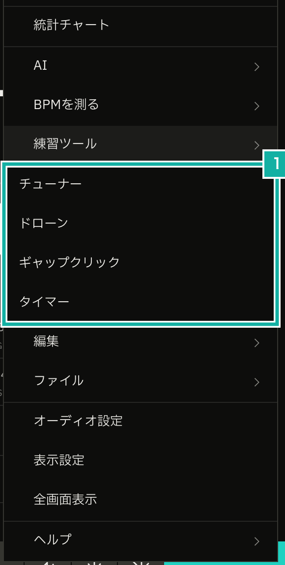
- It opens right below the row you pressed, at the same width
After it was released, using it on a smartphone showed three problems.
- Scrolling the menu with a submenu open moved only the parent menu, leaving the submenu behind
- Pressing the parent row again did not close the submenu
- The parent and the submenu had the same width and sat in the same place, so you could not tell where the submenu began
All three remain as long as the submenu is a separate box laid on top of the parent menu. We could have stopped the parent from scrolling while a submenu is open, but the boundary would still be unclear. So on narrow screens we stopped using SubmenuTrigger and list the submenu's items below the parent row instead, like an accordion.
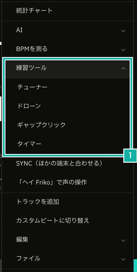
- The items are listed below the Practice Tools row, indented. The row's arrow points up
The submenu's items now live inside the parent menu, so they scroll with it. They are indented and separated from the rest by 1px lines above and below. The arrow on the right of the row points down when closed and up when open.
The parent row is a MenuItem that does not close the menu when pressed, and each press toggles it. Only one row can be open at a time; pressing another row closes the previous one.
<MenuItem
  aria-expanded={isOpen}
  shouldCloseOnSelect={false}
  onAction={onToggle}
>
  …
</MenuItem>
{isOpen && (
  <MenuSection aria-label={submenu.label} className="border-y border-mfm-subtle">
    {children}
  </MenuSection>
)}Without shouldCloseOnSelect={false}, pressing the row closes the whole menu. The toggle row does not run anything. So when the Menu's onAction receives that row's id, we ignore it instead of passing it to the function that runs actions.
On wider screens, submenus still open to the side with SubmenuTrigger.
The E2E tests look up which submenu holds an item in a table
The E2E tests found menu items by data-testid and pressed them. Items moved into a submenu are not on the page until their parent row is opened.
We put the mapping of items to submenus in a single file, and both the menu and the E2E tests read it. The file does not depend on React, so the E2E tests can read it too. The E2E helper that opens the menu and presses an item presses the parent row first when the item is inside a submenu.
export const APP_SUBMENUS = {
  ai: ["askAiForBpm", "askAiToEditSettings"],
  findBpm: ["detectBpmFromAudio", "detectBpmLive", "openTapTempo"],
  practiceTools: ["openTuner", "openDrone", "openGapClick", "openTimer"],
  edit: ["undoBpmSetting", "redoBpmSetting", "resetToInitialState"],
  file: ["importSettingsJson", "exportSettingsJson", "exportAudio"],
  help: ["openKeyboardShortcuts", "editKeyboardShortcuts", "openDocs", "contactUs"],
} as const satisfies Record<string, readonly AppMenuItemId[]>;Moving an item to another submenu does not require rewriting the tests. The docs pages have a menu too, but it has only five items, so it does not use submenus and lists them at the top level. When the helper cannot find a parent row, it presses the top-level item directly.